Delivering Innovation in Supportive Housing
-
DISH (Delivering Innovation in Supportive Housing) provides high-quality permanent housing for San Franciscans with serious health issues. While at DISH I was able to update and expand their visual messaging at each touch point. My goal was to build a strong graphic presence with the existing DISH branding that can be used year after year. I organized and designed a bi-monthly newsletter that went out to tenants, a logo and brand system for their annual fundraiser event, a variety of mail appeals, social media graphics, an illustrated hoodie for the annual staff gift, and designed their 2021 annual report.

Annual Report Design

Appeal Direct Mailers

Social Media Campaigns & Graphics

Tenant Newsletter
This bimonthly tenant newsletter keeps supportive housing residents informed and connected through local events, resident spotlights, and accessible content, designed for clarity, bilingual access, and visual inclusivity, with cover art by a DISH resident.

Staff Gift Illustration
For DISH’s annual staff gift, I illustrated a hoodie design inspired by the Windsor mural—a symbol of community in San Francisco’s Tenderloin, designed by 1 AM SF. Centered around a tree, the artwork features simplified versions of all nine DISH sites in its branches. The back showcases DISH’s tagline in bold, playful typography: I Believe Everyone Deserves A Home.

Fundraiser Branding
The BASH is DISH’s annual fundraising event. I created the logo and branding to capture the spirit of the welcoming, laid-back night that celebrates DISH’s work of welcoming people home.
I used circular and triangular shapes inspired by DISH’s logo to create dynamic, ever-evolving designs that keep marketing materials fresh yet on-brand.
I repurposed the iconic dot from the original DISH logo to create a bold, recognizable symbol for the BASH event branding. By integrating the circle dynamically with the typography, I introduced movement and energy that gave the logo a distinct, playful identity.


BASH Save the Date and Letter of Support

BASH Invitation and Welcome Sign (Event Photo by Rob Suguitan)

Social Media Graphics
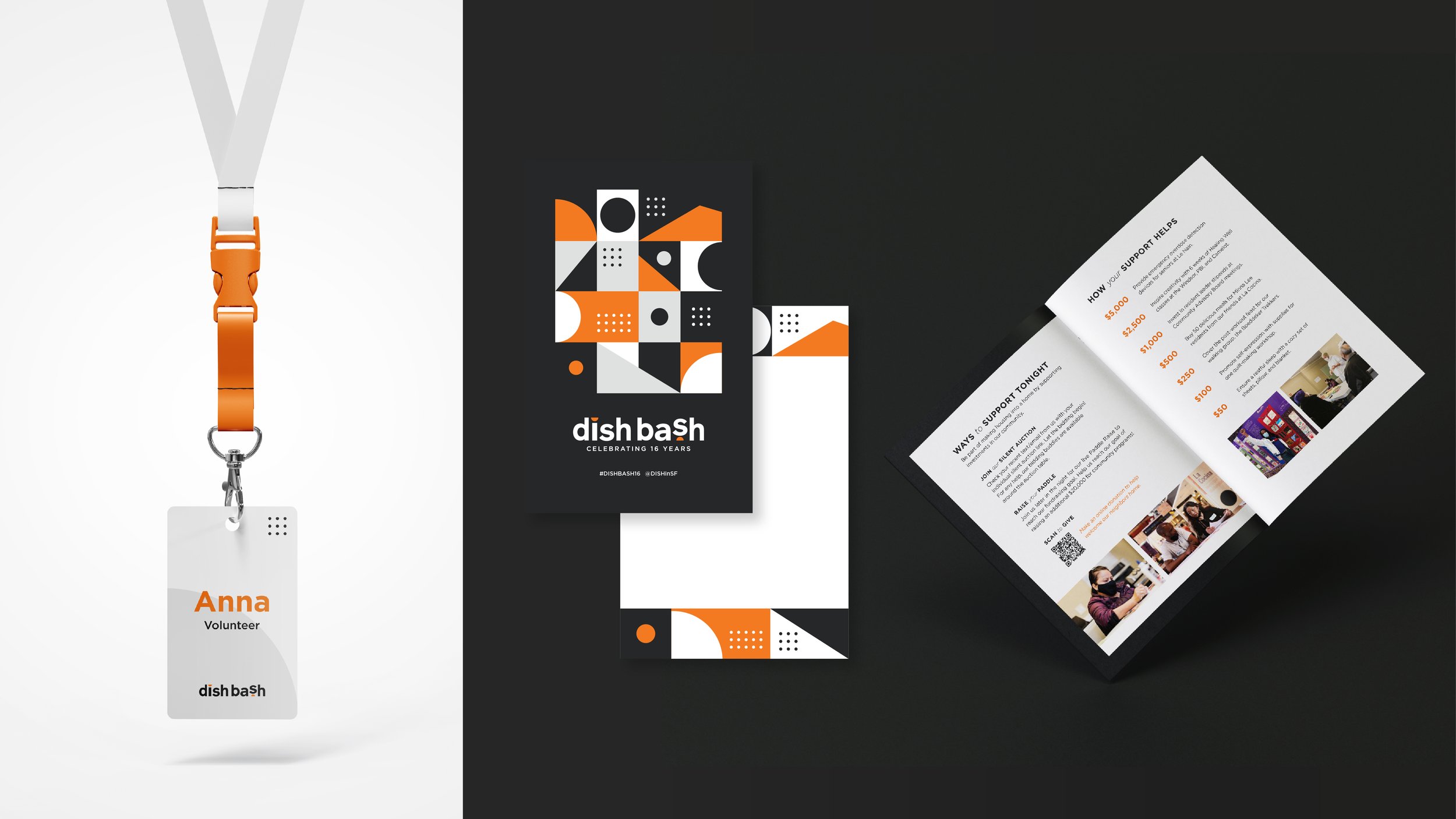
Volunteer Name Tag and Program Design